Send the good stuff
Get new articles, case studies, and updates straight to your inbox (no spam, promise).
Filter by:

New year resolutions that will make you a better presenter
When it comes to building presentation decks, many of us hold onto habits that don’t change year to year. Instead of perfection, this post focuses on how to make small, high-impact shifts (like simplifying messages, improving visual hierarchy, and designing for real audiences) that will help make your presentations clearer and easier to reuse.
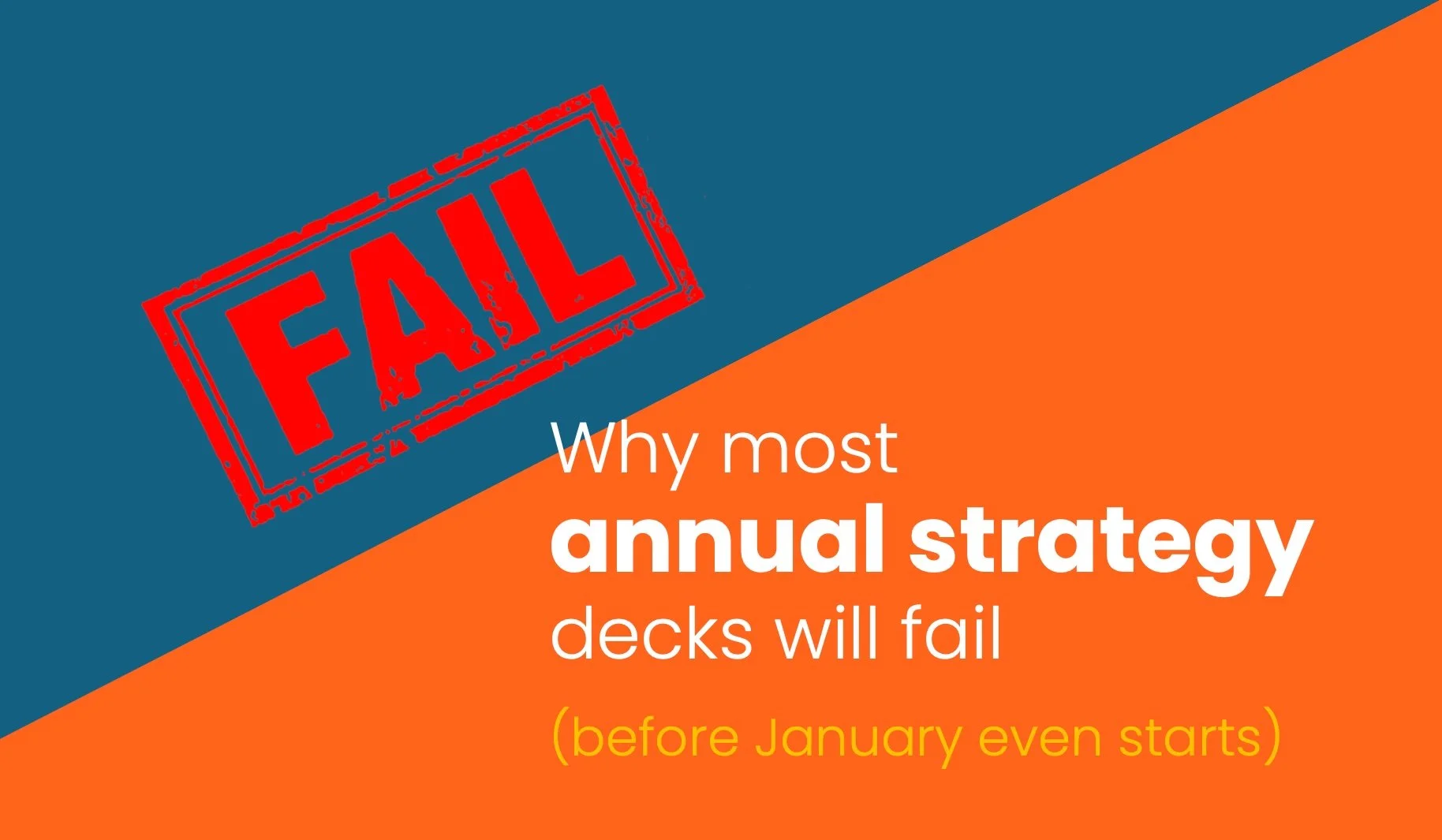
Why most annual strategy decks will fail (before January even starts)
Most annual strategy decks fail before the year even starts because the information is too vague, too crowded, and too disconnected from day-to-day work. Learn where planning decks go wrong and get practical tips to make strategy more specific and easier to act on so your 2026 plan lives beyond the annual planning meeting.

The power of Slide 0: How to align stakeholders before you start your deck
Most teams jump straight into building slides then wonder why the deck feels muddled or needs constant revision. The real fix happens before slide 1 ever exists. “Slide 0” is a simple way to get stakeholders aligned before the deck even gets built. By clarifying the strategy up front you avoid rewrites, conflicting feedback, and wasted hours.

Beyond the deck: Turning presentations into evergreen content
Most presentations die after the meeting, buried in shared drives, never to be opened again. But the best ones live on. From one-pagers and infographics to guides and playbooks, learn how to turn your deck into an ecosystem of evergreen content that keeps your message moving across teams and out to market.

The problem with most 2026 planning decks (and how to fix yours)
Most 2026 planning decks miss the mark, not because the strategy is wrong but because it isn’t communicated in a way that people understand. Too often, planning decks are bloated with jargon, bullets, and spreadsheets that bury the story. This post breaks down why most planning decks fail and what to do differently.

How to give your board a clear view of business health
Board decks can quickly turn into data dumps with copy-pasted spreadsheets and messy CRM screenshots. By redesigning a dashboard slide, information was transformed into a clear snapshot so board members could easily see progress, spot gaps, and make decisions faster.

Design that makes strategy obvious
Without the support of strong visuals, strategy falls flat and the chance to capture that “a-ha” moment quickly disappears. In this example, content strategy was buried under a dense wall of text and bullet points. Instead of guiding the audience, the slide overwhelmed them. All the details, made it hard for anyone to see what mattered and why. See a before-and-after.

Do you really need that build?
Slide builds can make or break a presentation. Used well, they guide your audience through complex ideas, keep attention on the right details, and add momentum to your story. Used poorly, they slow you down, frustrate your audience, and turn slides into click-heavy clutter. Get practical tips on when builds work and when they don’t.

Good decks don’t present themselves
Slides alone can’t carry a presentation. While a polished deck helps frame your story, it’s your prep and delivery that make the presentation memorable. Learn how to balance slide content with spoken detail, why practice matters, and how to think about delivery through pace, tone, and eye contact.
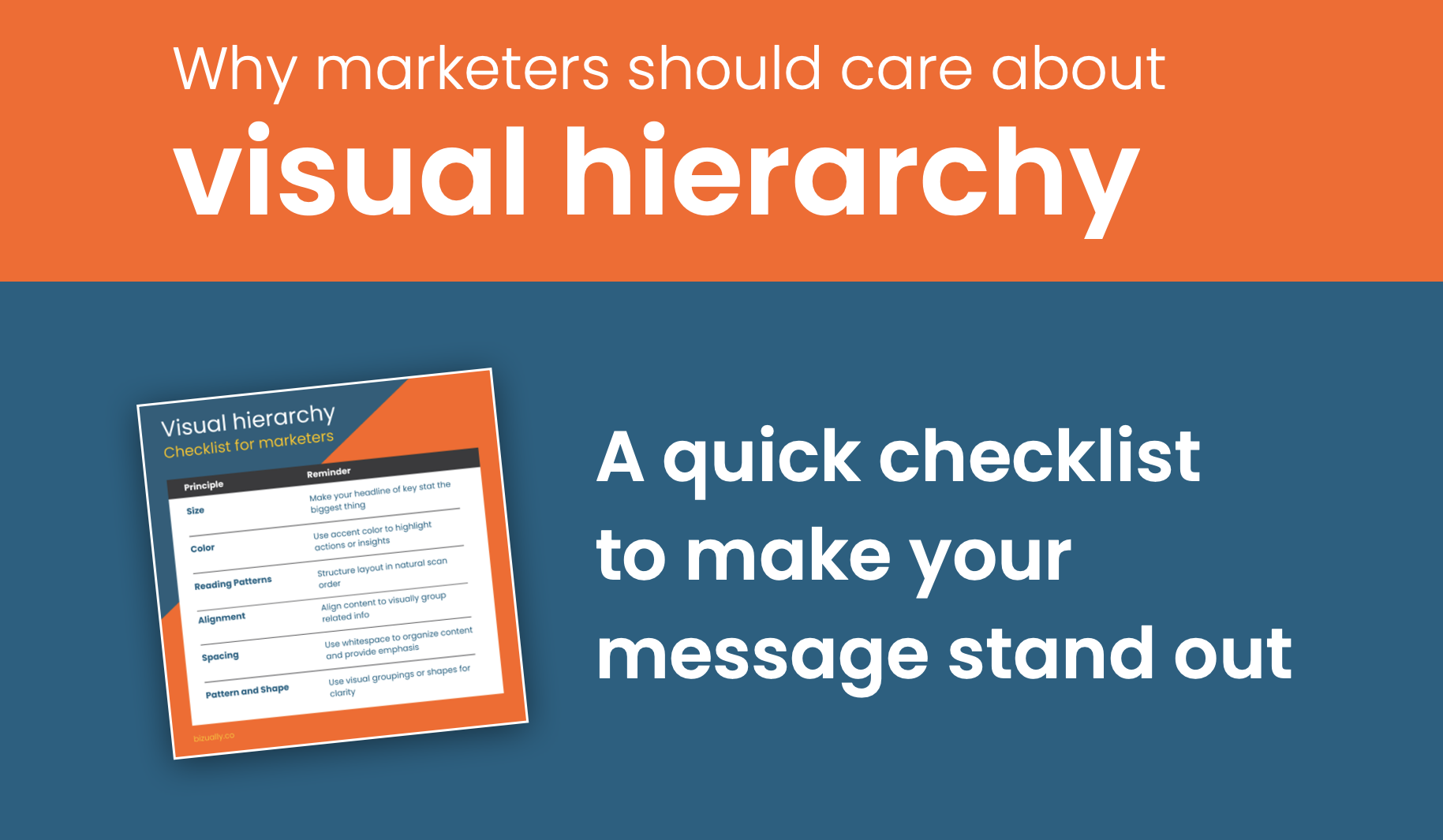
Why marketers should care about visual hierarchy
For marketers, creating content is just the first step: making sure it’s instantly understood is what drives results. Visual hierarchy guides your audience’s eye to what matters most, shapes first impressions, and moves deals forward. Learn why hierarchy is critical for marketers.