Why marketers should care about visual hierarchy
Marketers live and breathe content. Infographics, 1-pagers, guides, decks… we’re constantly creating materials for prospects and customers. But if your audience can’t instantly make sense of what you’ve created, they’ll tune out.
That’s where visual hierarchy comes in.
What is visual hierarchy (and why does it matter for marketers)?
Visual hierarchy is the way design guides the viewer’s eye to what matters most. It’s the order of importance your audience subconsciously assigns to text, images, and layout.
For marketers, it’s the difference between someone skimming your content and missing the point versus immediately grasping your value prop and taking the next step.
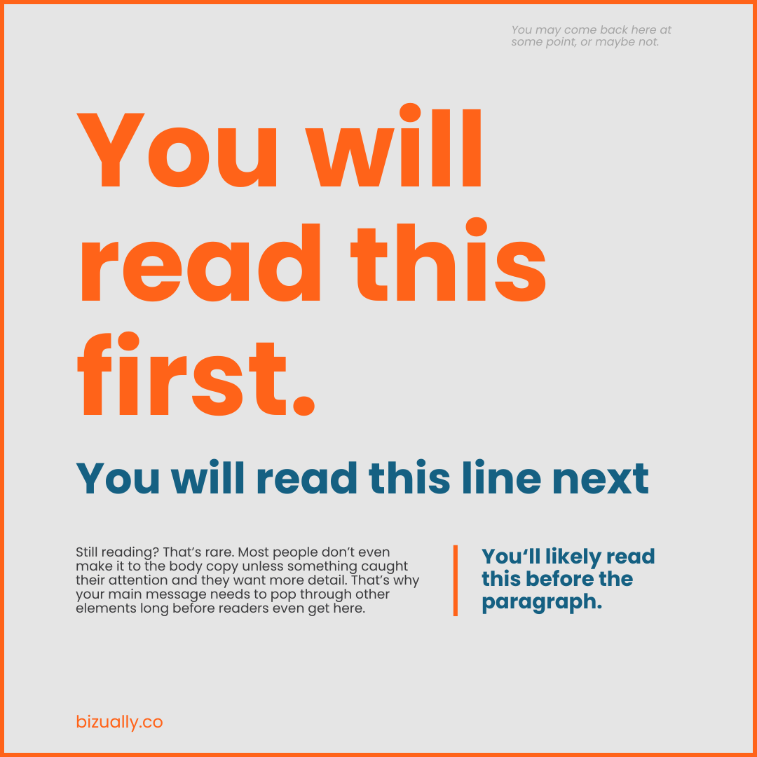
Since most people scan instead of read, you need to design with that in mind so the right information stays memorable.
Why marketers should care
It shapes first impressions
You get seconds, sometimes less, to capture attention. A clear headline, bold data point, or striking visual placed at the top of your marketing materials can make all the difference.
It reduces cognitive load
When content feels cluttered, your audience works harder to figure out what’s important. Cognitive science shows we’re wired to look for patterns and order. Visual hierarchy does the heavy lifting for your reader so they can focus on your message, not your formatting.
It moves deals forward
Hierarchy isn’t just about pretty design. In a 1-pager, it ensures your core value prop isn’t buried halfway down the page. In a guide, it helps buyers skim to find what matters to them. And in an infographic, it tells a story step-by-step, without overwhelming.
The right hierarchy means your audience not only understands your message but knows what to do next.
Applying visual hierarchy
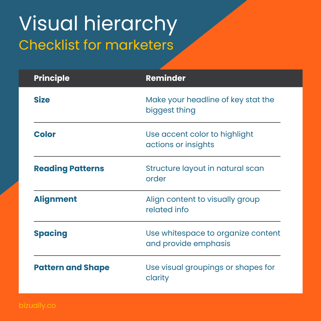
6 key principles that gets your message seen and understood:
1. Size
Larger elements catch the eye first, whether that’s headers in an 1-pager or the main stat in an infographic.
Key Takeaway: Don’t bury your key message. Make it big enough to be the obvious entry point.
2. Color
Bright or contrasting colors instantly stand out.
Key Takeaway: Want your CTA or offer to pop visually? Use color intentionally, not just for aesthetics but as an arrow pointing the reader towards action.
3. Reading Patterns
Western readers scan left to right, top to bottom, often in an F-shaped pattern.
Key Takeaway: Structure your content to match natural eye flow. Put the “must-see” items top left, then guide attention downward logically. That subtle flow helps get your message across before readers lose focus.
4. Alignment
When elements line up, they feel related. When they don’t, things look messy.
Key Takeaway: Align text, visuals, and callouts so it’s clear what belongs together. Consistency builds trust and makes content easier to digest.
5. Spacing (white space)
Empty space is not wasted space. It helps the important stuff stand out.
Key Takeaway: Give breathing room around your logo, value props, stats, and CTAs. A cluttered 1-pager looks overwhelming. A clean one looks actionable.
6. Patterns and shape
Our brains notice shapes and groupings. Unique shapes signal importance. Visual groupings suggests relationships or related content.
Key Takeaway: Use distinctive shapes or visual groupings to signal importance or category, like grouping steps in a flow chart or highlighting a key quote in a unique shape. It visually guides the reader’s understanding.
When applying visual hierarchy in marketing materials, ask:
Can someone understand your main point in 10 seconds?
Does the eye flow naturally from headline to supporting detail to call-to-action?
If not, you’ve got a hierarchy problem.
More than just a design principle
Beyond a design principle, visual hierarchy is a storytelling tool that helps marketers turn content into momentum. When your audience can instantly see what matters, you can better cut through noise and move them closer to action.