The problem with most 2026 planning decks (and how to fix yours)
We’re smack in the middle of Q4, which means the annual flood of planning decks is about to hit. You know the ones… 60 slides deep, packed with 8-point font, buzzwords, and charts pulled from at least four different tools. Every team wants to show their “strategic alignment,” but somehow the story gets lost between slide 12 and slide 48.
The problem? Most planning decks don’t present well to an audience.
Let’s fix that before your 2026 plan joins the pile.
The usual suspects: What’s wrong with most planning decks
Too wordy
If your deck looks like a PDF manual, it’s not a presentation — it’s a punishment. When every idea, metric, and caveat lives on the same slide, you’re hindering, not helping, your audience.
Why it happens: Teams confuse documentation with communication.
The fix: Slides should highlight ideas, not house them. Keep the details in the appendix or your notes, not front and center.
Too vague
“Drive growth.” “Enhance efficiency.” “Accelerate innovation.” If your strategy sounds like it could fit any company, in any industry, then what’s the point?
Why it happens: People want to sound visionary but avoid being pinned down.
The fix: Find ways to show what actual success looks like with supporting metrics, milestones, and examples.
Too lifeless
You’re telling the story of your company’s future, and how your department or function aligns to this, not reading the minutes from a meeting.
Why it happens: Accuracy takes priority over conversation.
The fix: Use visuals to add interest and structure. Strategy should make people nod, not nap.
What great planning decks do differently
Great planning decks tell a story that flows. In its most basic form, it comes down to:
Where we are → Where we’re going → How we’ll get there
They visualize, don’t verbalize
You don’t need 20 bullet points to explain a framework. You need one clear visual that connects the dots. Visual hierarchy, color, and other design elements can help your audience grasp what matters in seconds.
They focus on what’s next
Recapping every project from the past year doesn’t move the company forward. People are interested in what’s coming next, what’s getting in the way, and how can they help support? Every slide should earn its keep by answering one of those questions.
How to fix yours (before it’s too late)
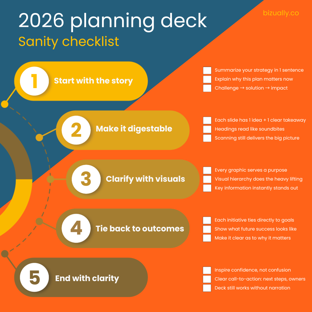
1. Start with the story
Can you summarize your 2026 strategy in one sentence?
Does the first slide explain why this plan matters now?
Is there a clear narrative (challenge → solution → impact)?
2. Make it digestable
Does each slide has one idea, one key takeaway?
Do headings read like soundbites?
Can you scan through the decks and still grasp the big picture?
3. Visuals that clarify
Does every graphic or chart serve a clear purpose? (not just decoration)
Is visual hierarchy doing the heavy lifting?
Does key information, metrics, or timelines stand out instantly?
4. Tie back to outcomes
Does each initiative connect directly to the goal or KPI?
Are future-state slides clear about what “success” looks like?
Is it clear why each section matters to the wider organization?
5. End with clarity
Does your final slide inspire confidence?
Is there a clear call-to-action? What happens next, who owns it?
Could someone who wasn’t in the meeting still understand the plan?
Regardless of how great your strategy is, it will fail if it isn’t clearly communicated and people don’t understand it. When your audience gets the strategy and sees what’s ahead, they’re far more likely to believe it and get behind it.